19 Nov Minimalist Website Design – Why You Should Embrace Simplicity
You may have heard the word “minimalist” thrown around quite a bit in today’s design world. That’s because it’s a great way to showcase your business or portfolio online in a modern way that others will enjoy. We believe that less is more, and here are some reasons why.
Whoa!
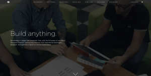
The immediate reaction many people have towards a simple, minimalist website is WHOA! There are a lot of art elements that go into a site like this. That means, a lot of cool things are being seen and enjoyed. Websites are no longer just to provide information; they need to be experienced. This means smooth scrolls, full-widths, maybe more white and black than you’re used to, and yes, even a video background.

Check out the new Squarespace 7 for away cool minimal design example with a video background.
Simple, Yet Informative
Often times the word “simple” may translate as “uninformative”. This is simply not true! (Pun intended.) While it is true that most minimalist designs are filled with graphics, photos, and videos, there is always a message being conveyed. It might not be in paragraphs of text, but the information is still present. In the modern age of social media and smartphones, most people aren’t interested in reading line after line about your company. We’re visual creatures who need visual aids, and this is done well with minimalist websites.

Splash is a great example of simplicity combined with a flow of information.
But, I’m Old School
Okay, so you may still enjoy the “old school” look of websites. That’s totally ok! However, the simple designs are what will attract people to your site. You may think that because you’ve had the same website for centuries your clients won’t be able to handle a new design, or even that you’ll lose business because of it. NOPE! Clients and customers actually love change. It shows that you’re constantly involved in your company and want to make the most of their experience. So embrace the idea that maybe it’s you who suffer from change flu and try a fresh and simple redesign.

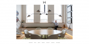
Daniel Hopwood does simple perfectly. Even a footer menu?! That’s so new school.
If you’re not convinced that less is more, that’s okay. Minimalism isn’t for everyone or every business. However, if you’re willing to give it a shot it could be a really creative option for your website. And hey, we’d love to try out some simple designs for you. Call us!
No Comments